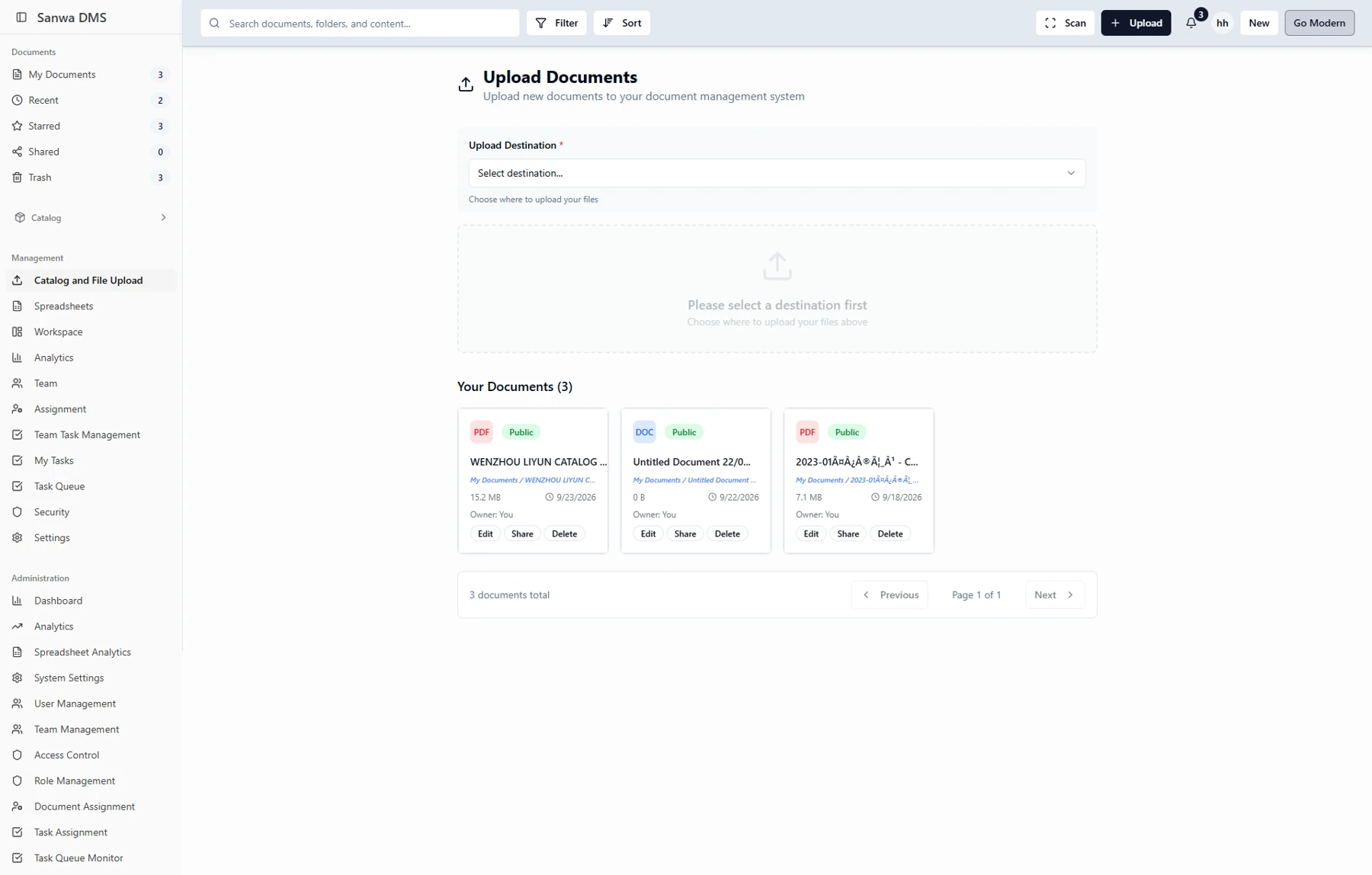
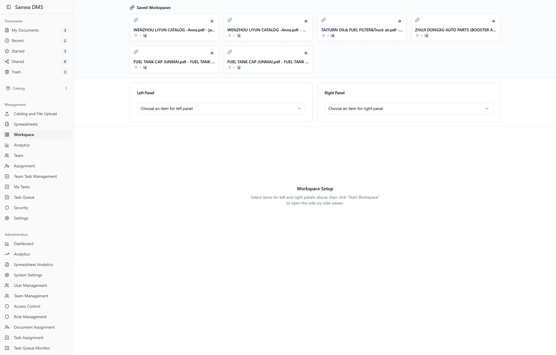
Make setup explicit.
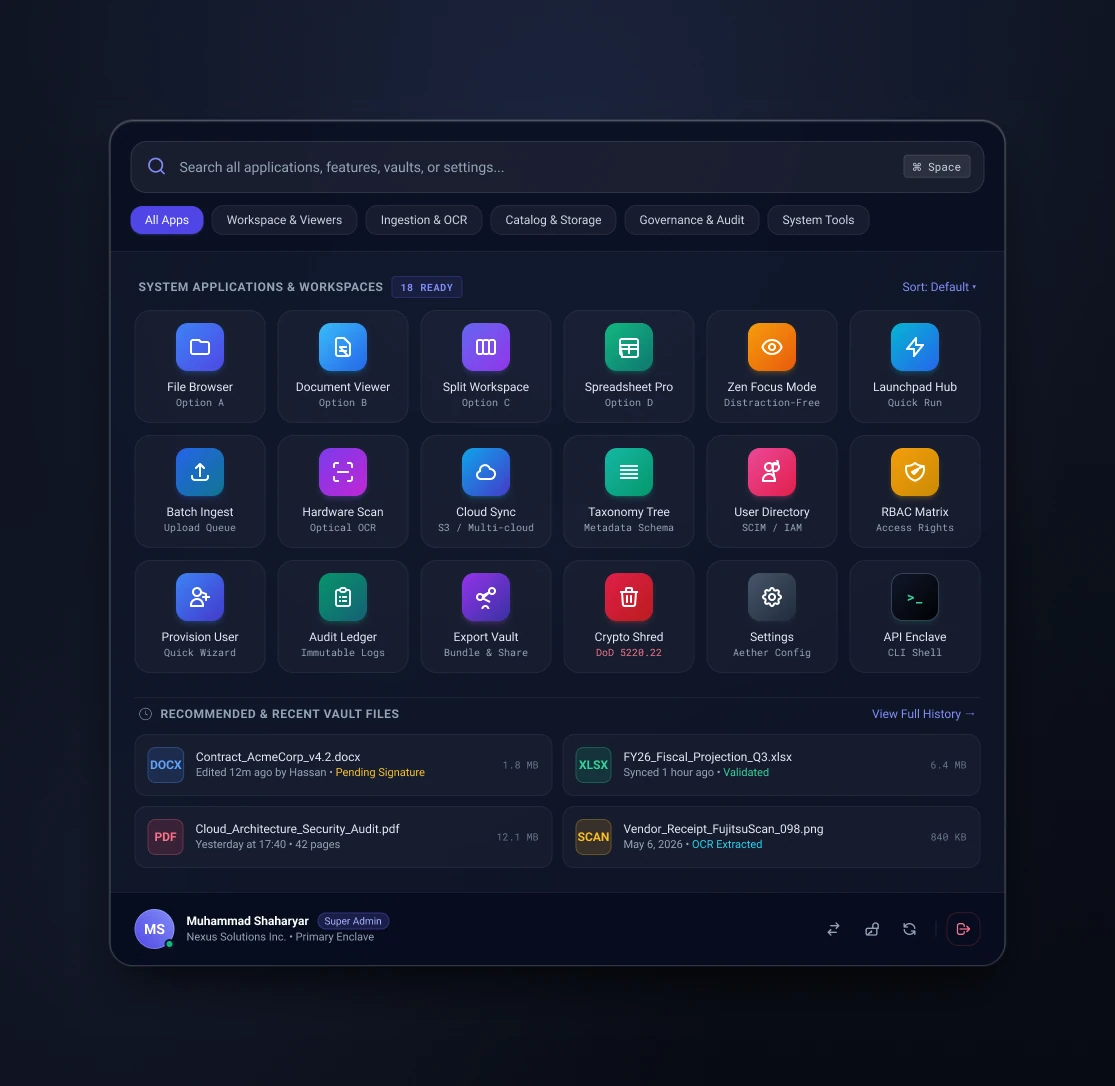
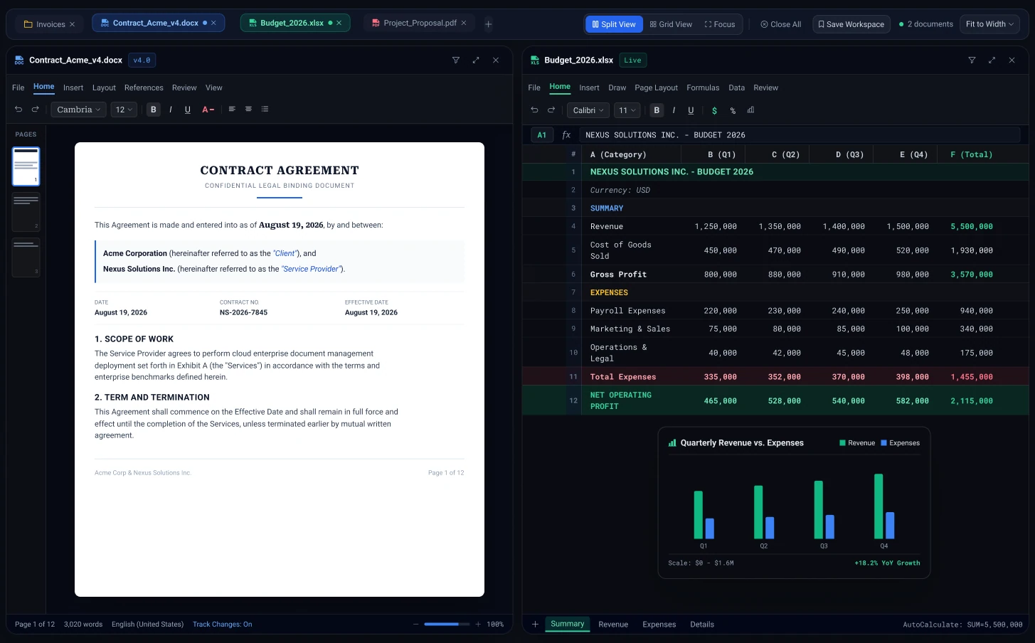
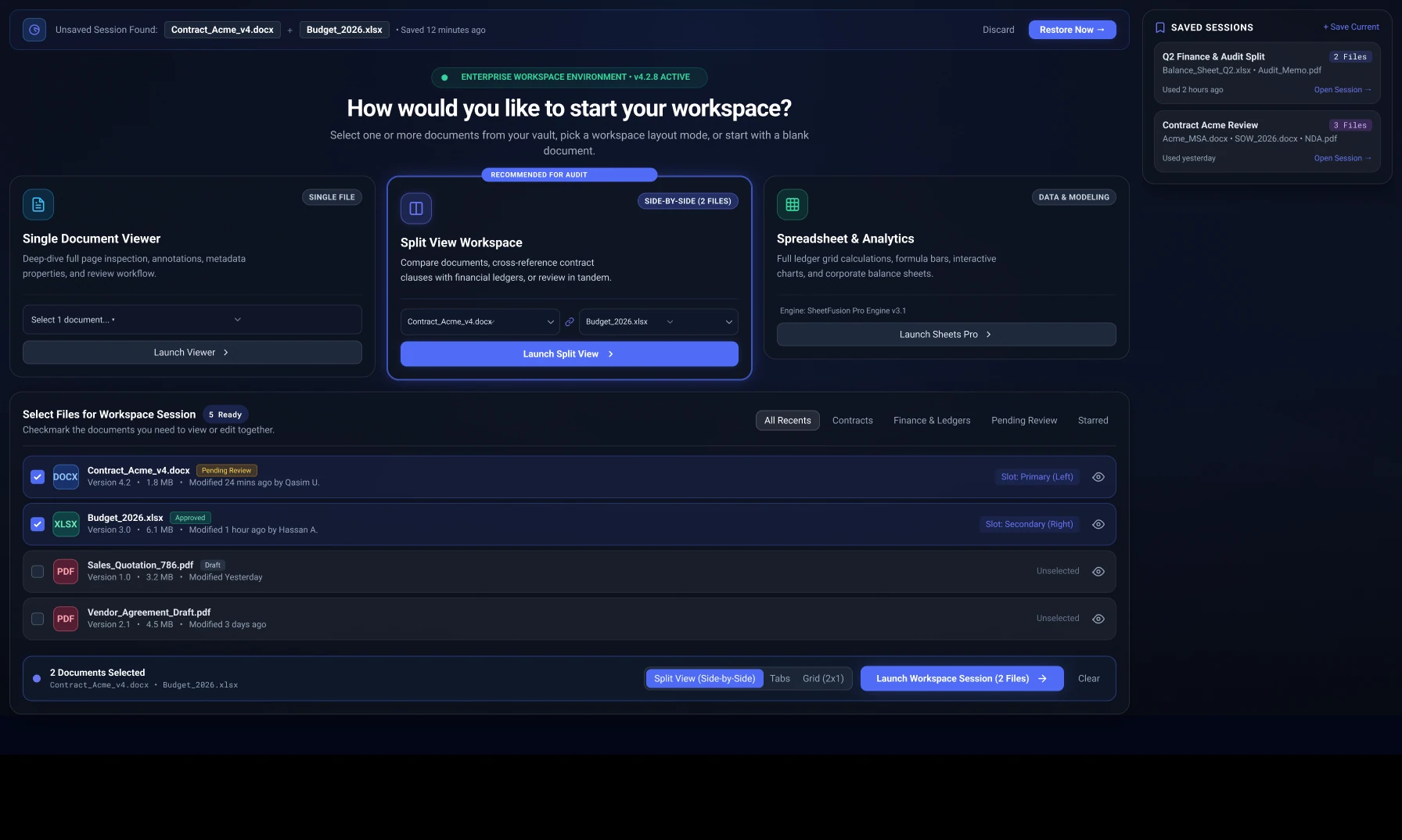
Workspace layout modes, document slots, and session recovery make the starting point more deliberate.
DMS brings document work, task coordination, and administration into a shared desktop experience. A redesign told through the previous interface, the new screens, and the decisions that connect them.
DMS redesign
Workspace, documents, tasks, teams, and settings
14 previous screens / 38 new screens
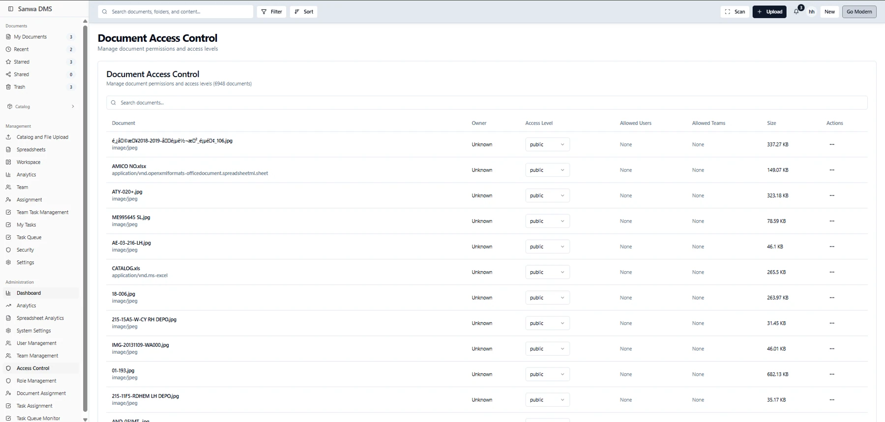
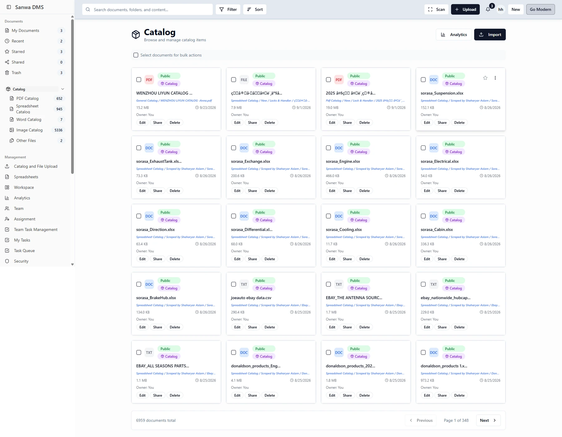
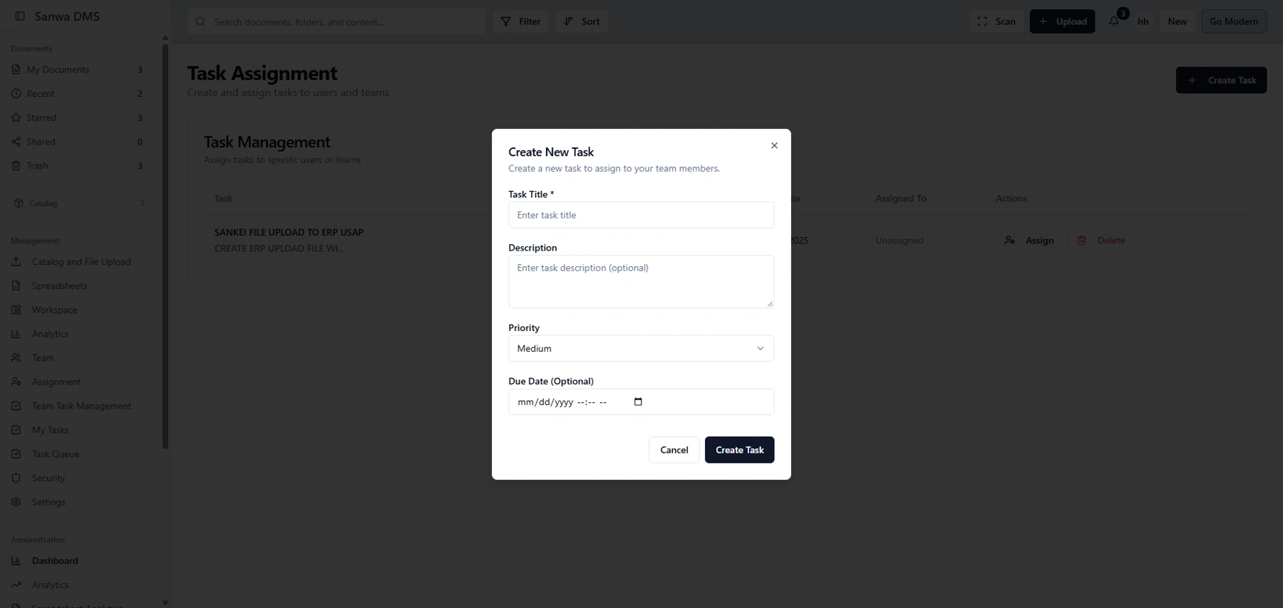
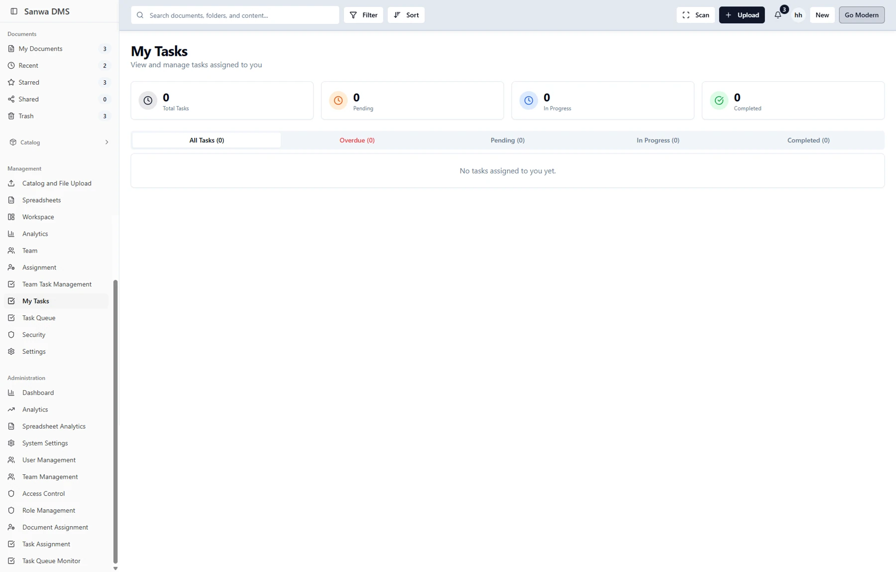
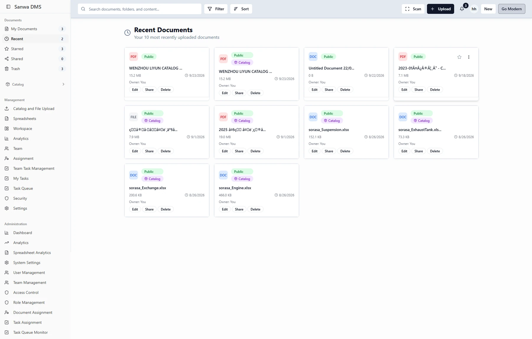
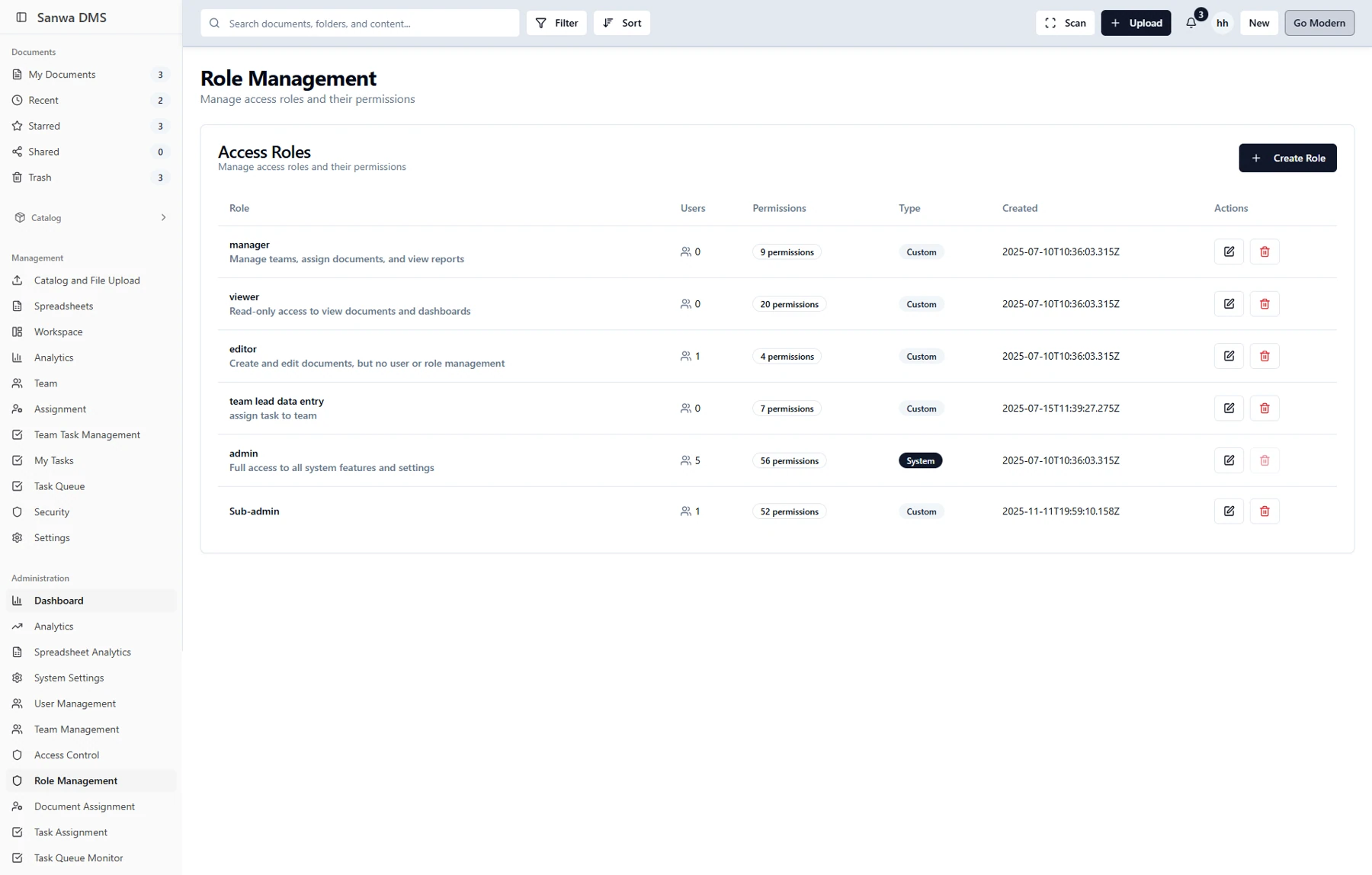
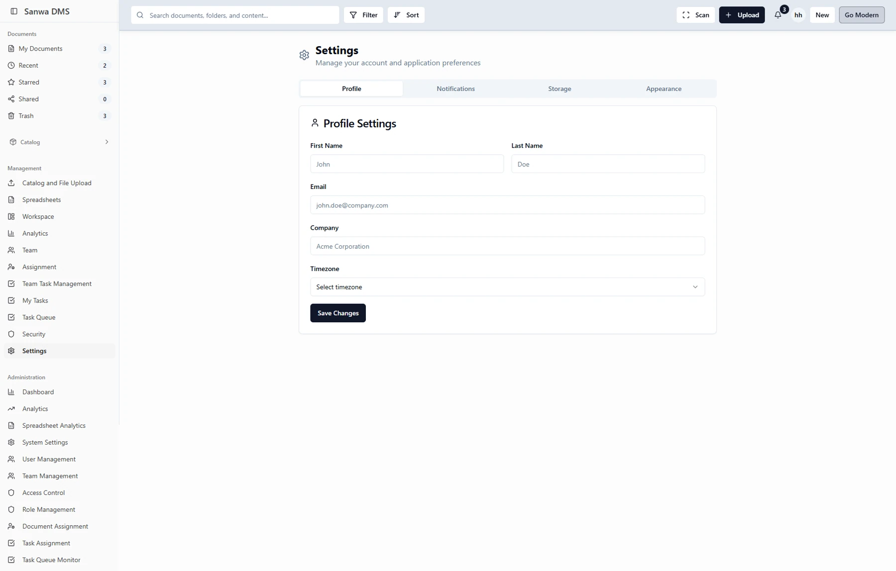
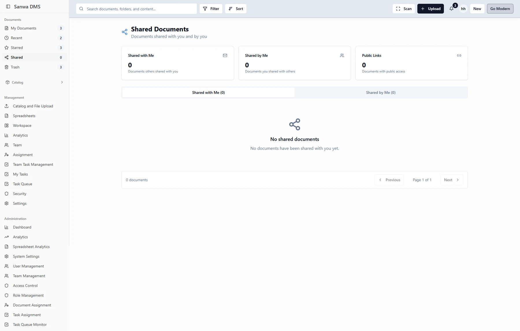
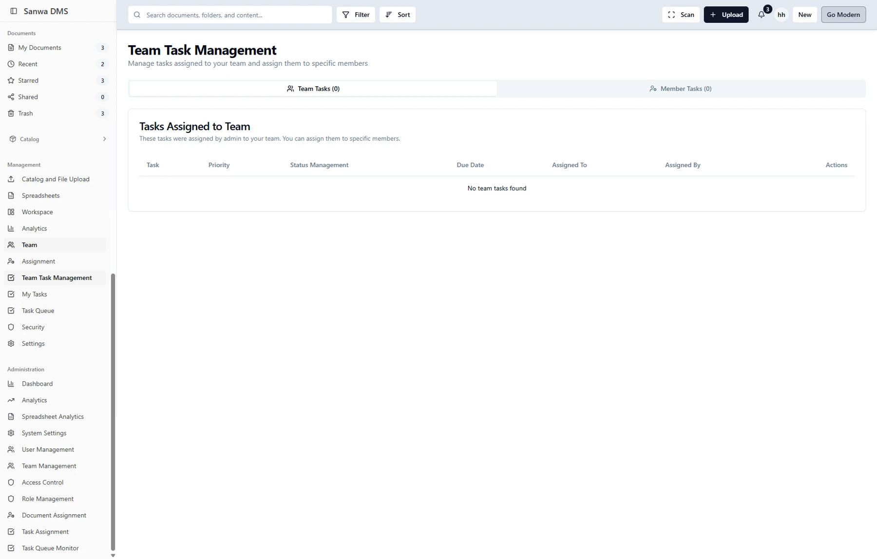
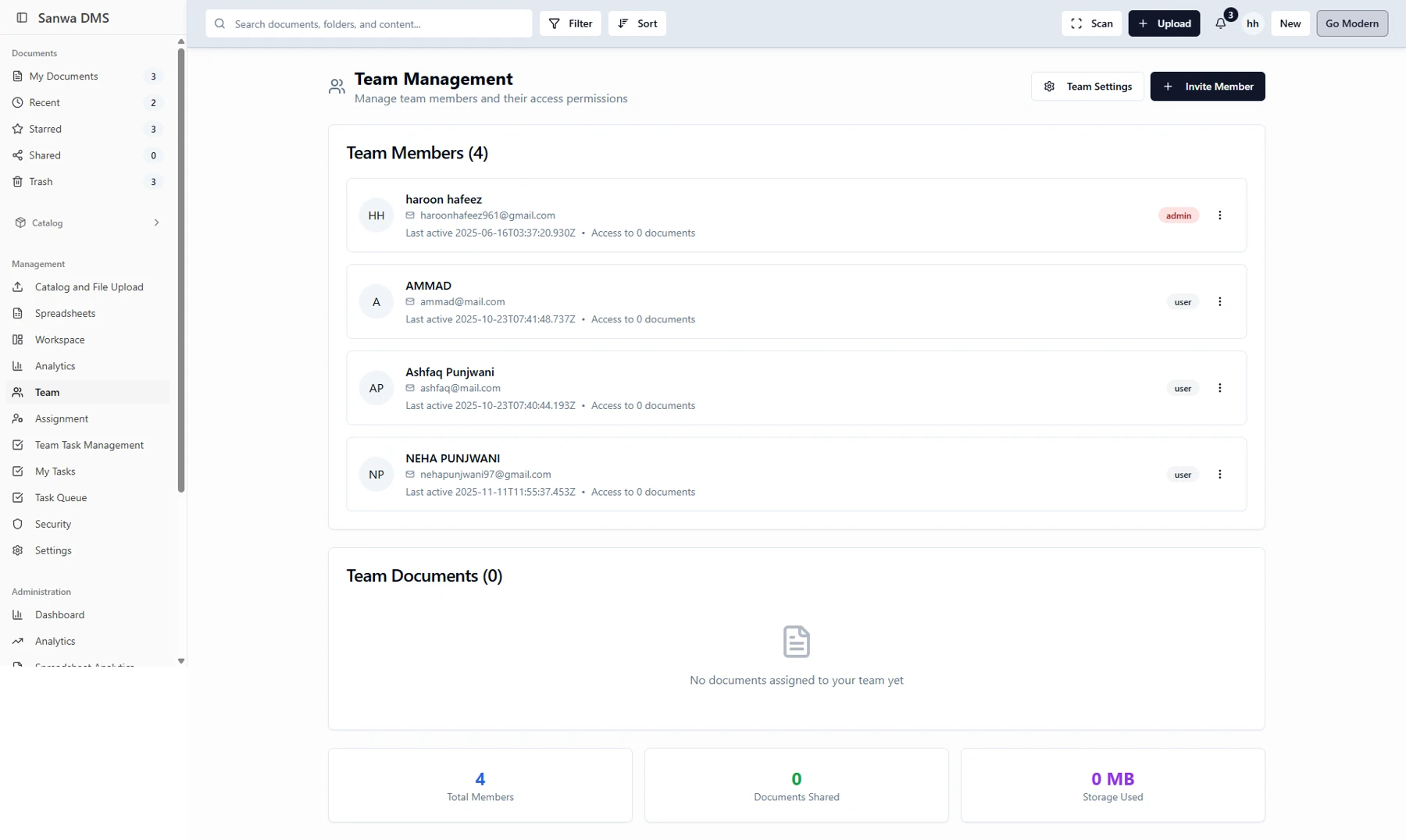
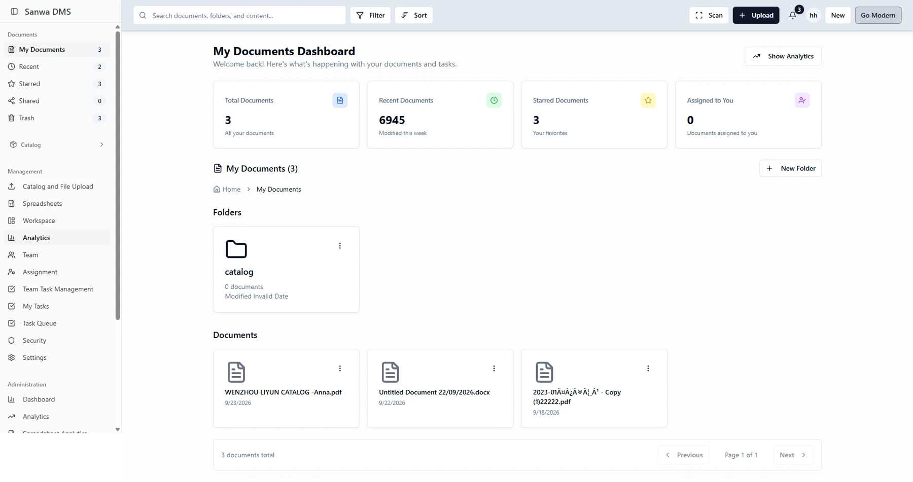
The previous interface centers on document lists, summary counts, basic tasks, and administrative tables. It supports recent files, saved documents, uploads, and sharing, but much of the surrounding work sits in separate views.
The new direction broadens the workspace: document retrieval, assignments, team coordination, and configuration share a consistent environment.
Compare three parts of the original interface with their redesigned counterparts. Open a screen to inspect the details.
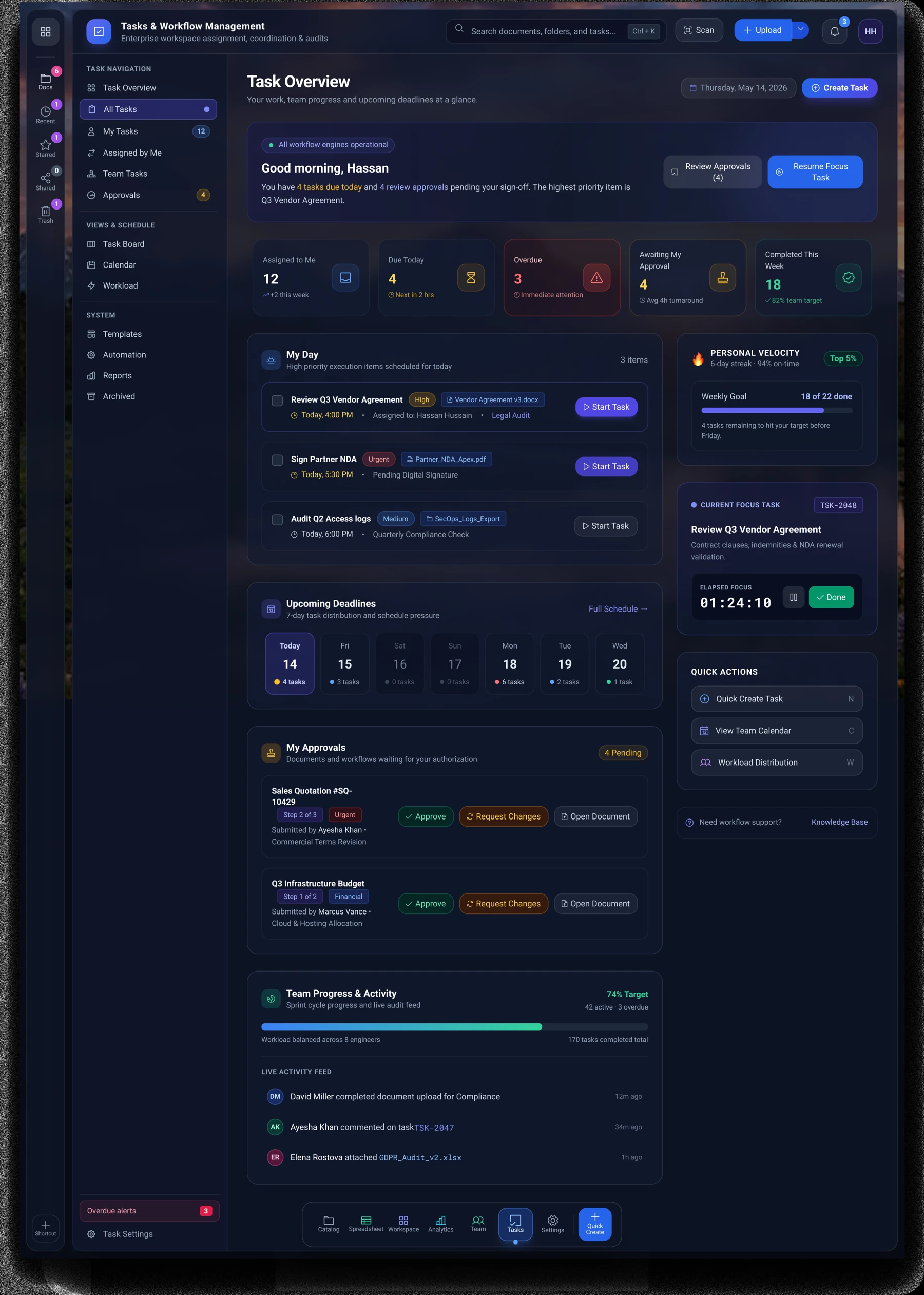
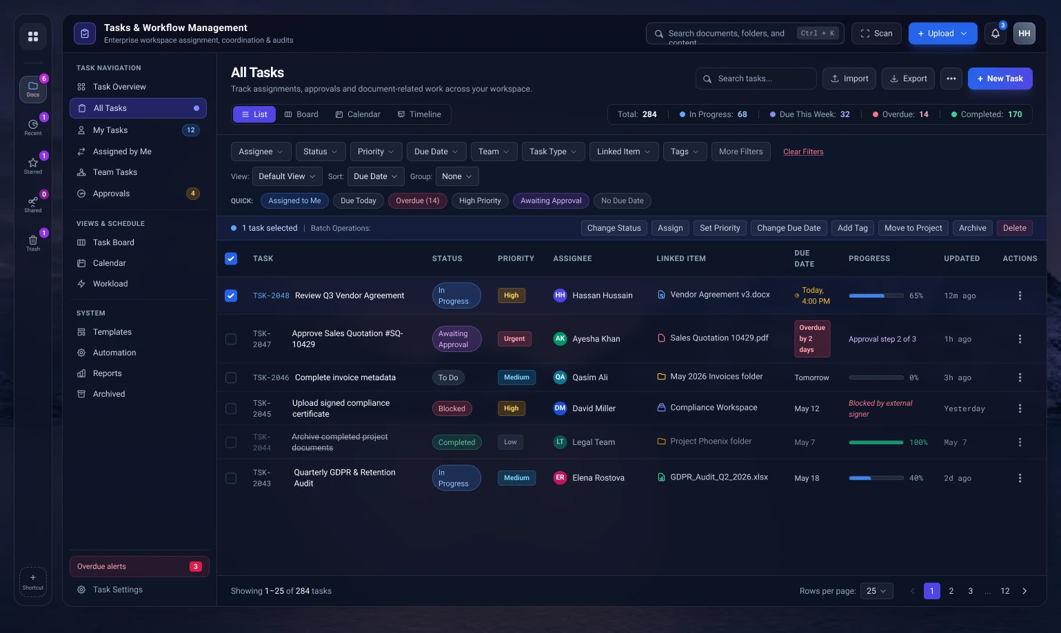
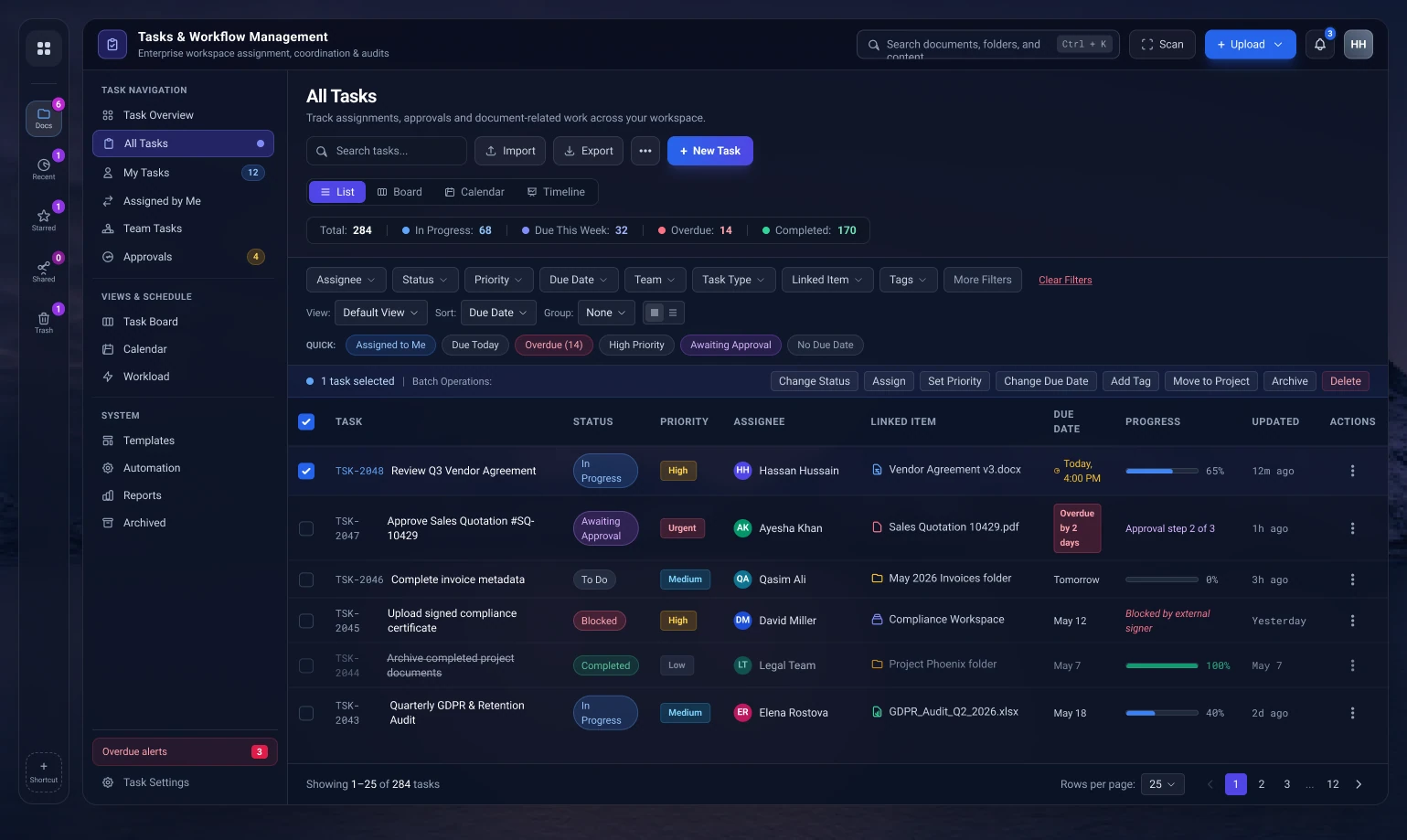
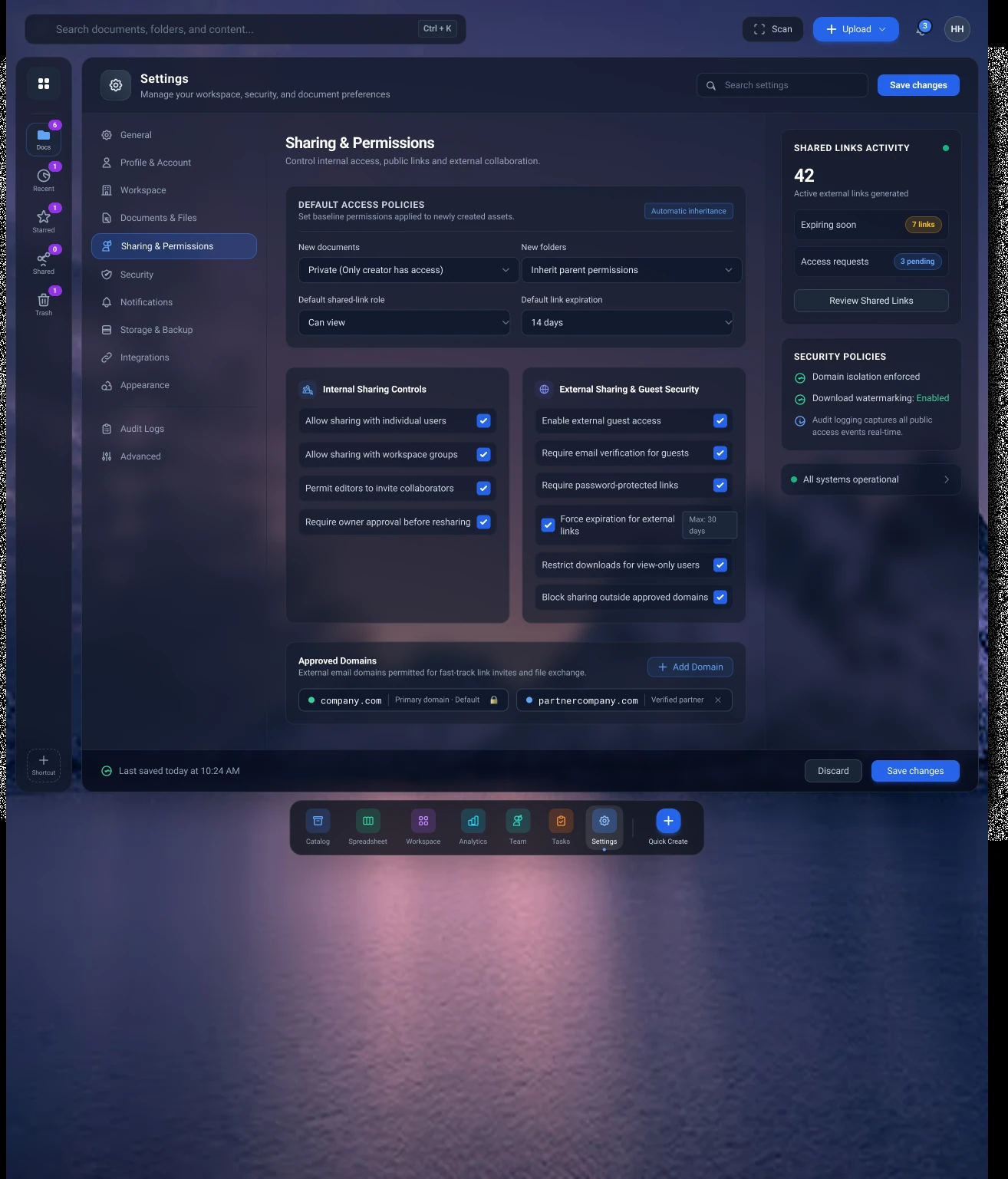
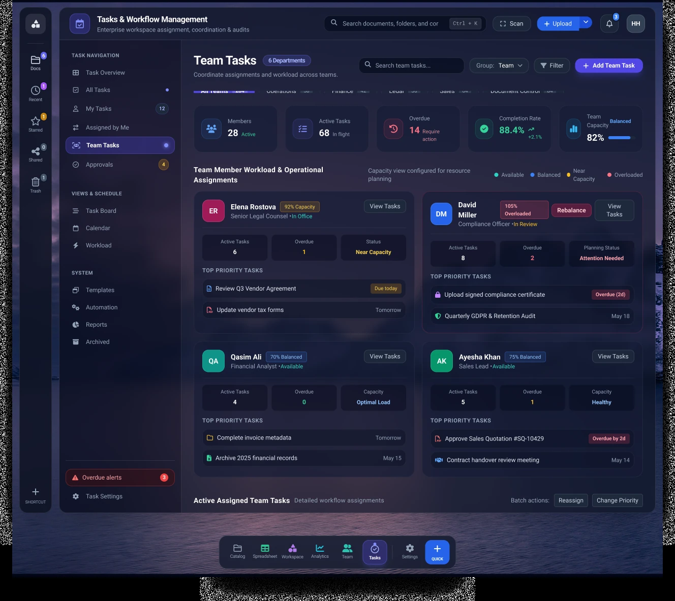
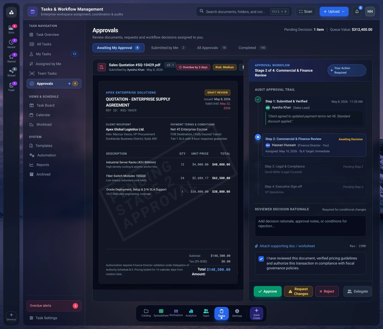
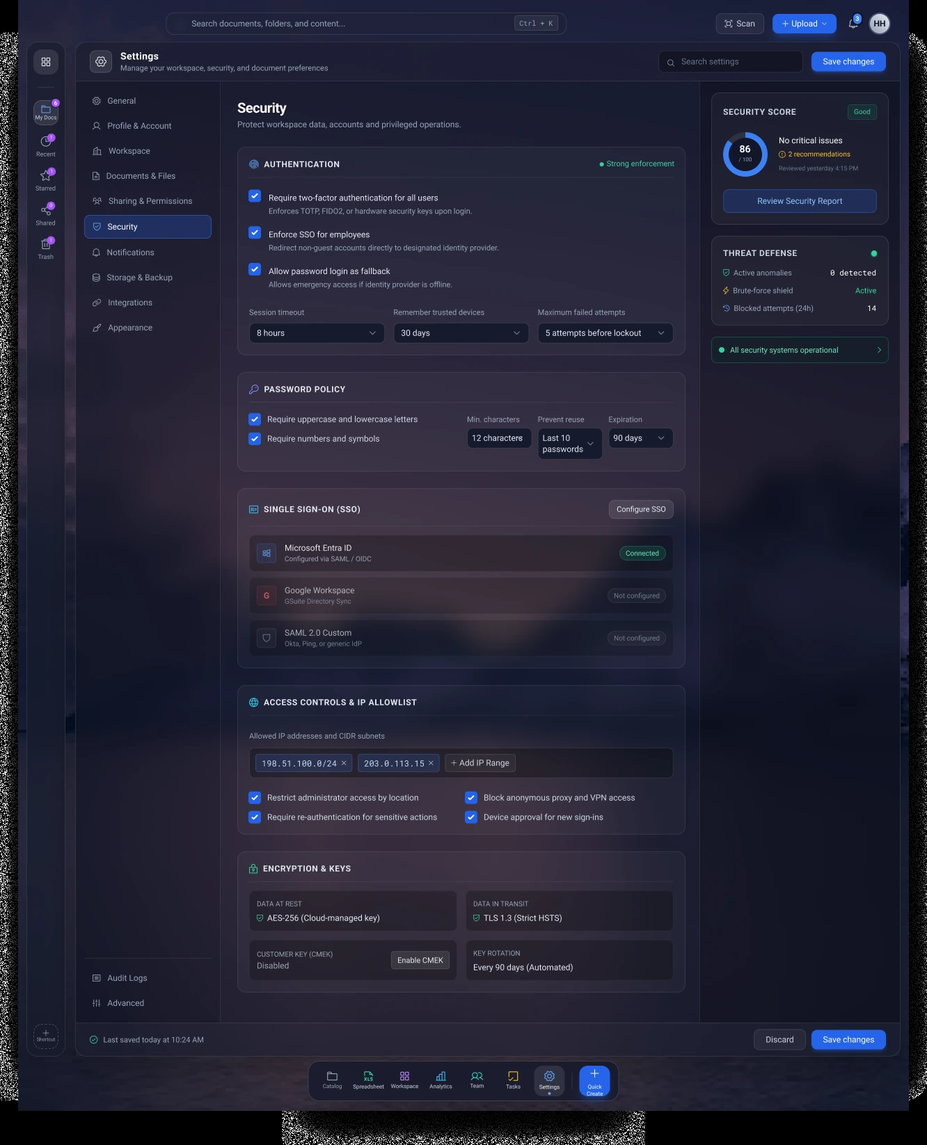
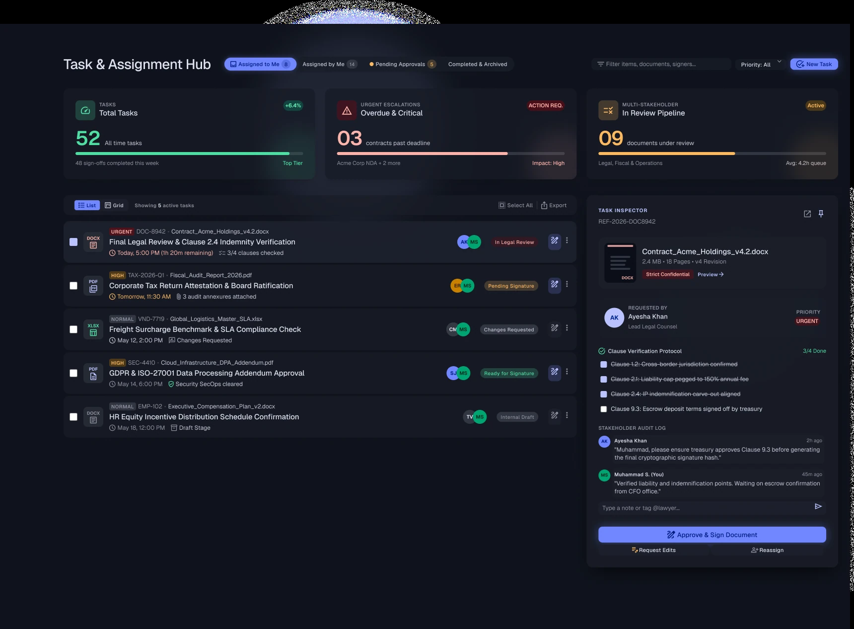
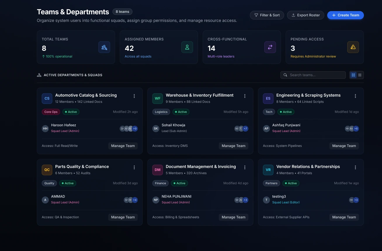
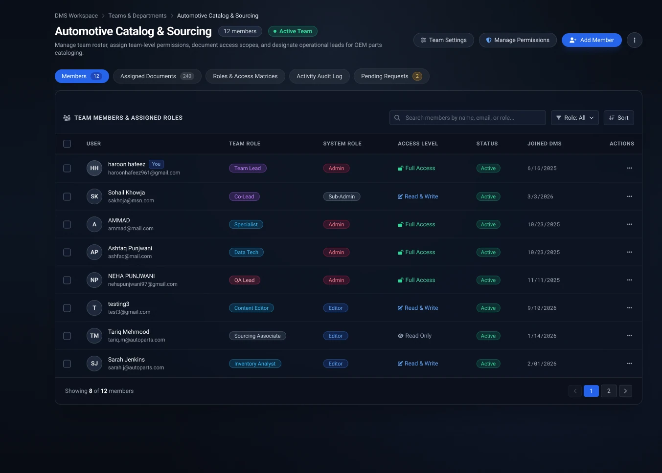
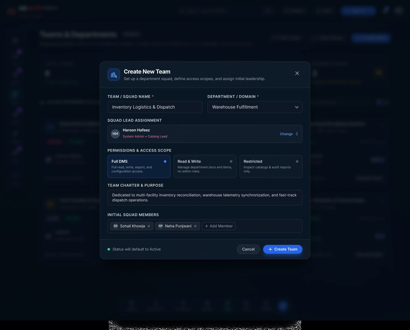
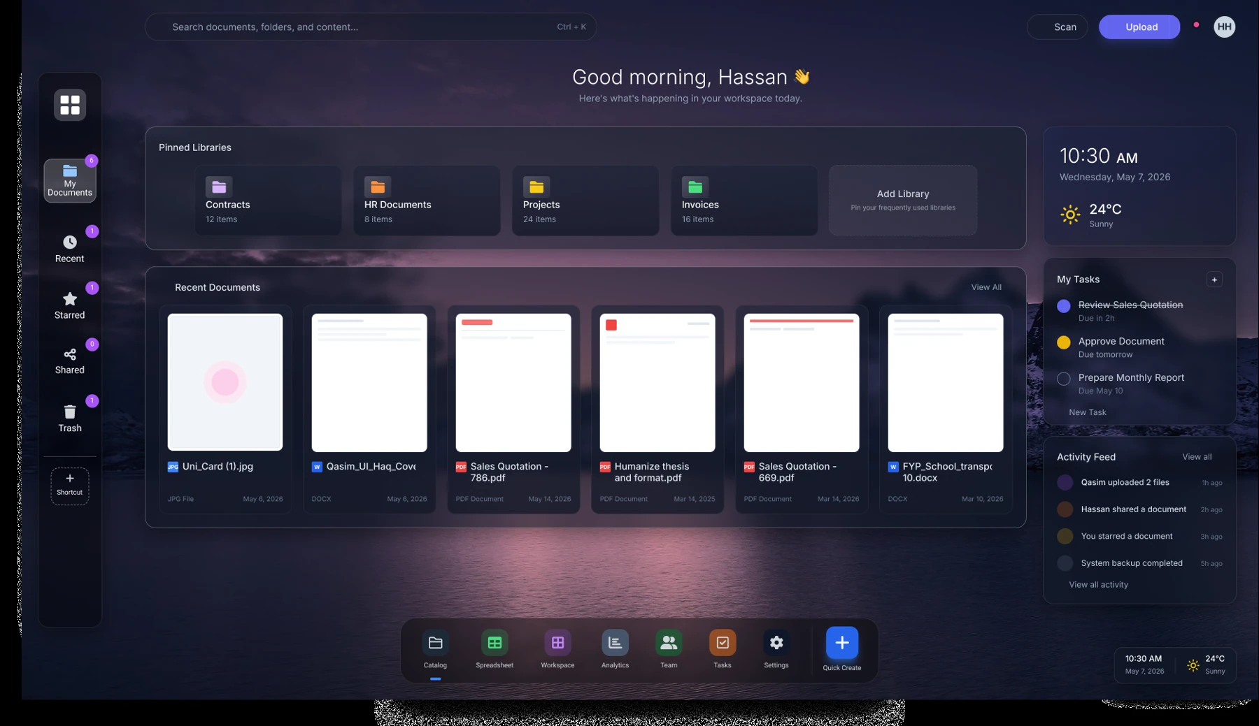
A vertical rail, a bottom dock, and recurring navigation patterns establish a desktop-like shell. Overview screens summarize the current situation; lists and boards support action; modals keep creation and inspection close to their context.
Workspace layout modes, document slots, and session recovery make the starting point more deliberate.
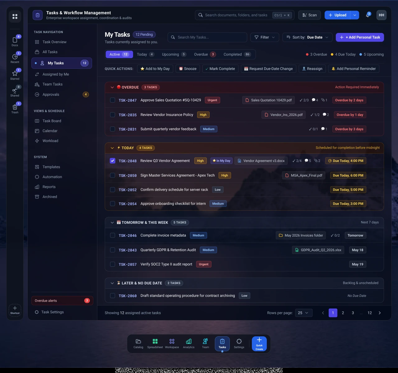
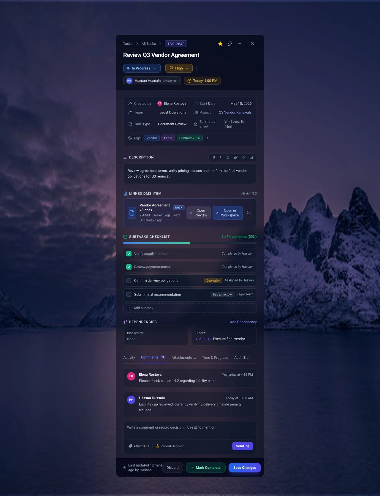
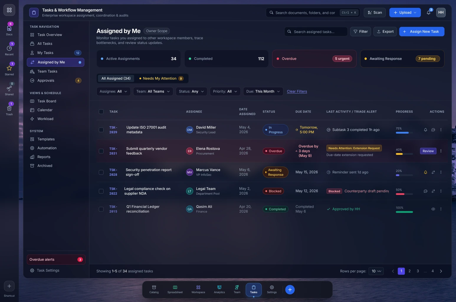
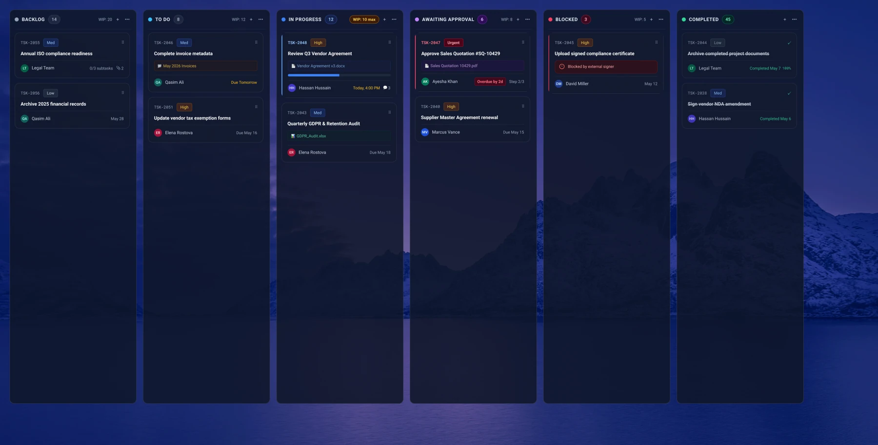
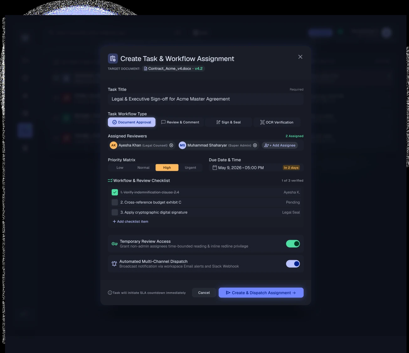
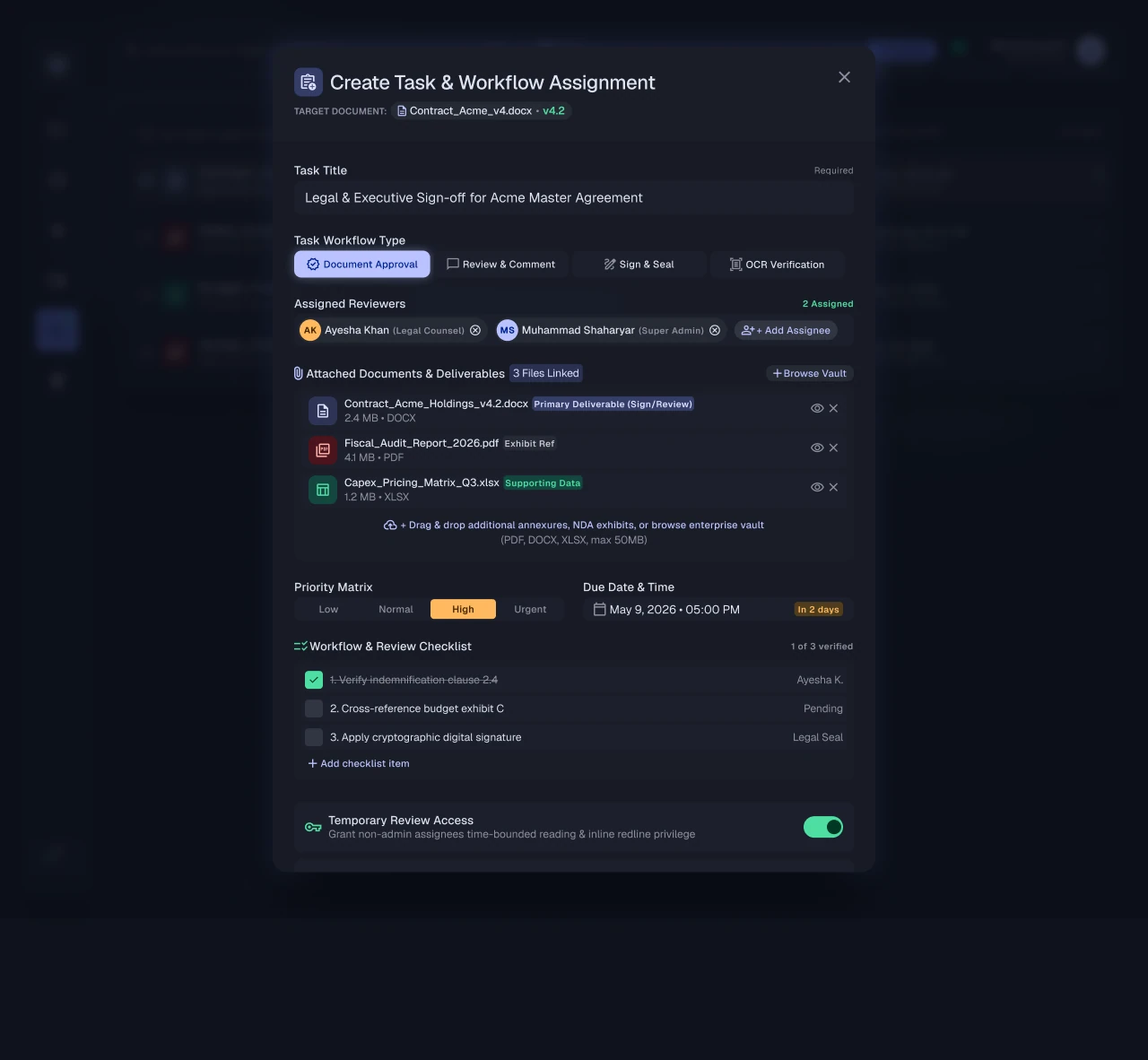
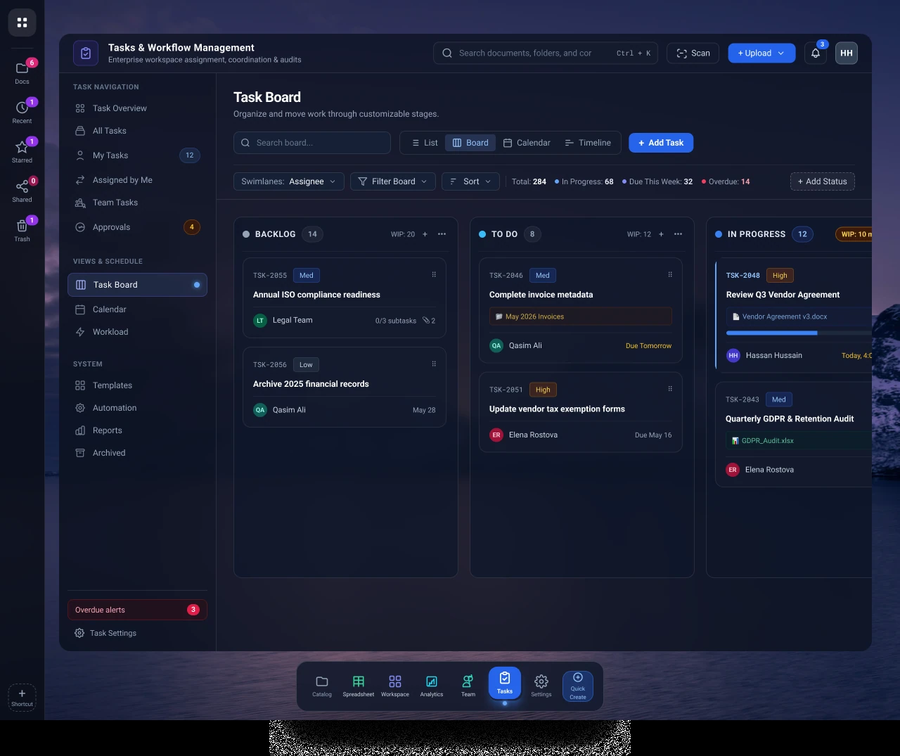
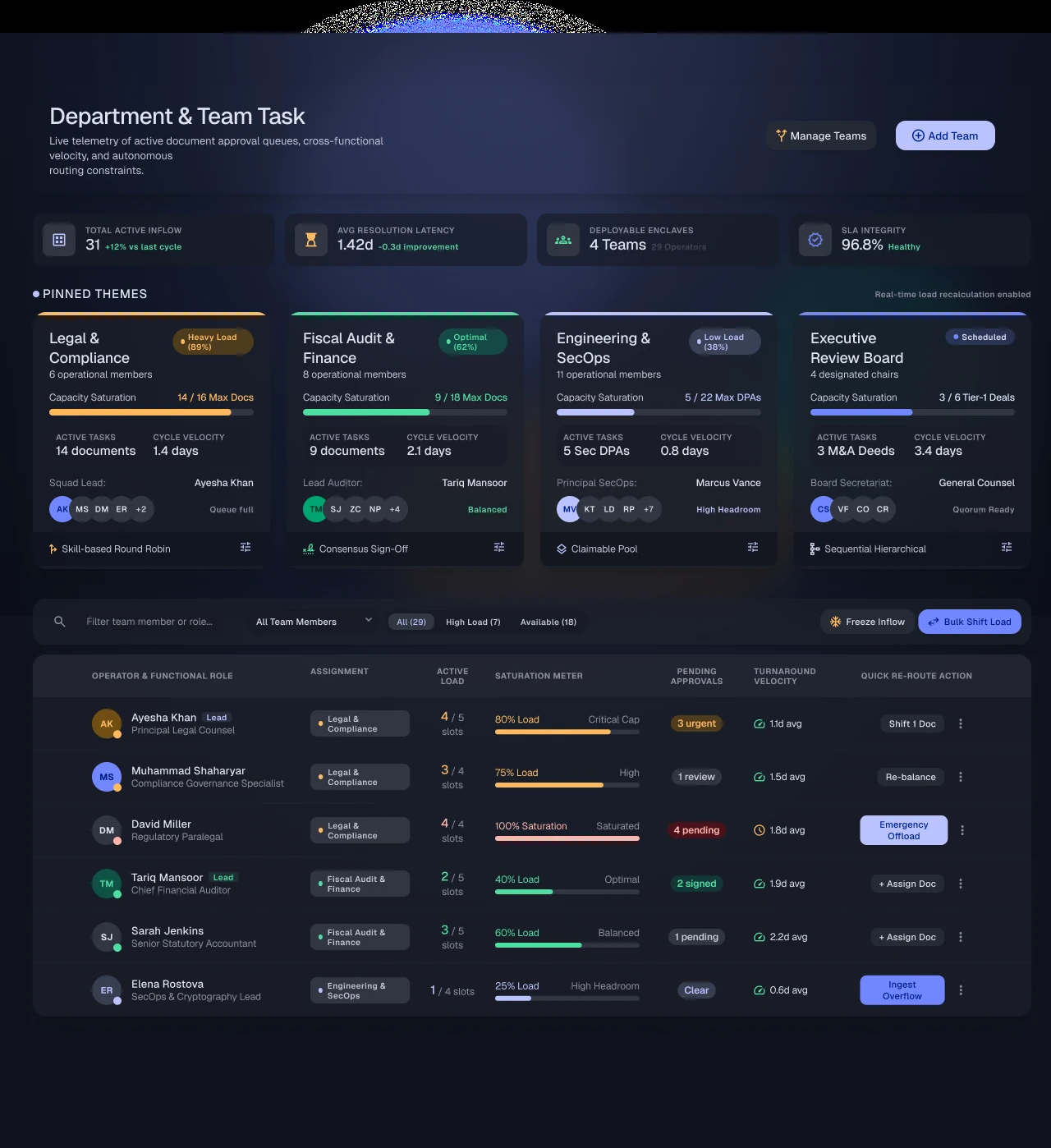
Priority, ownership, due dates, and status give assignments a clearer place in daily work.
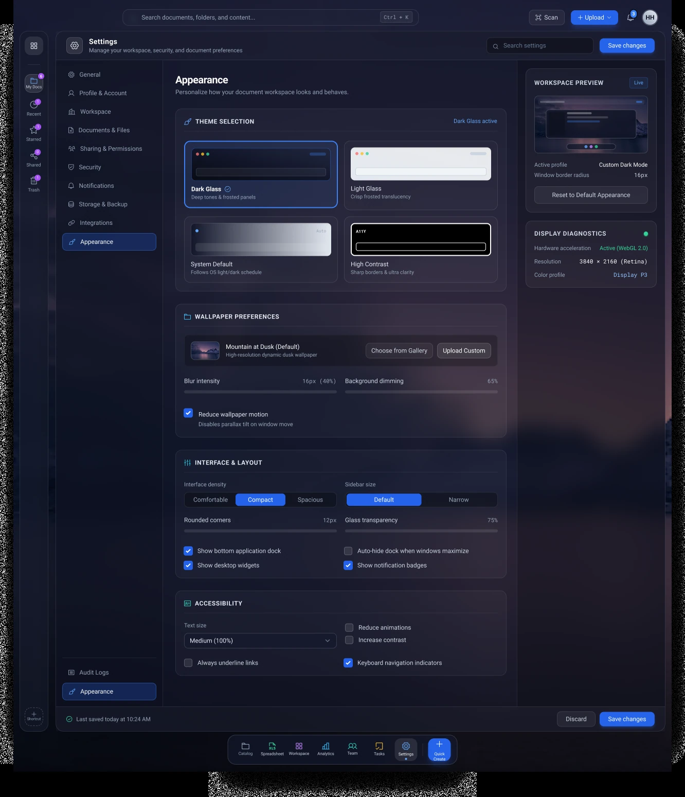
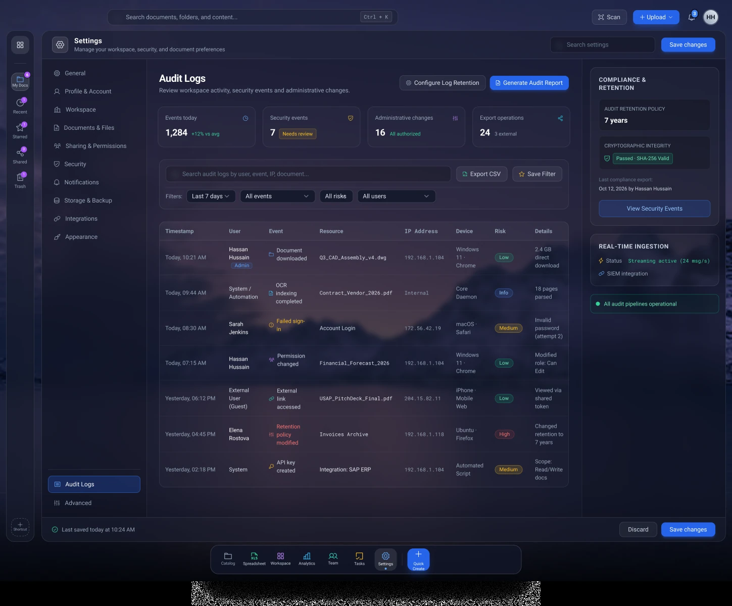
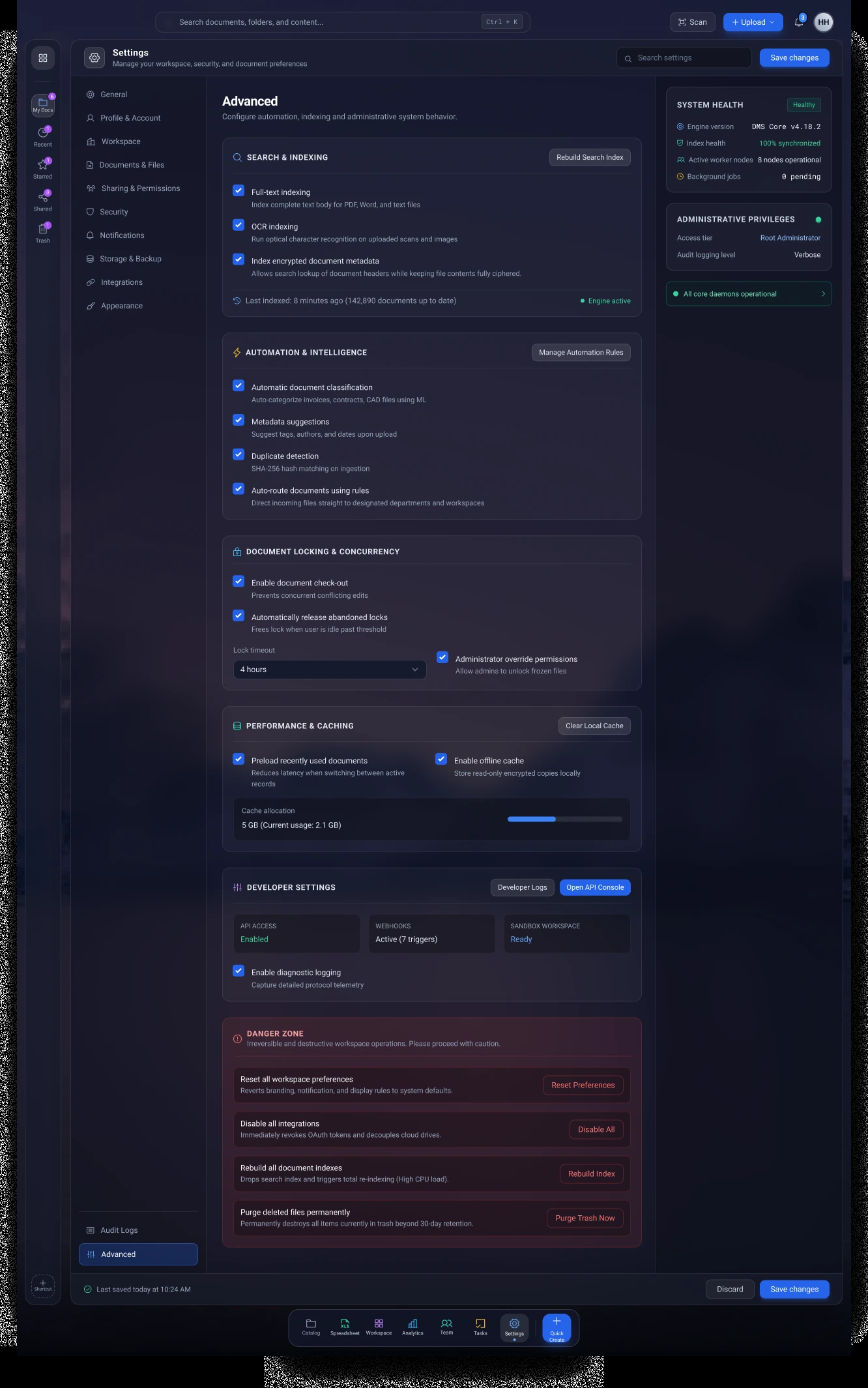
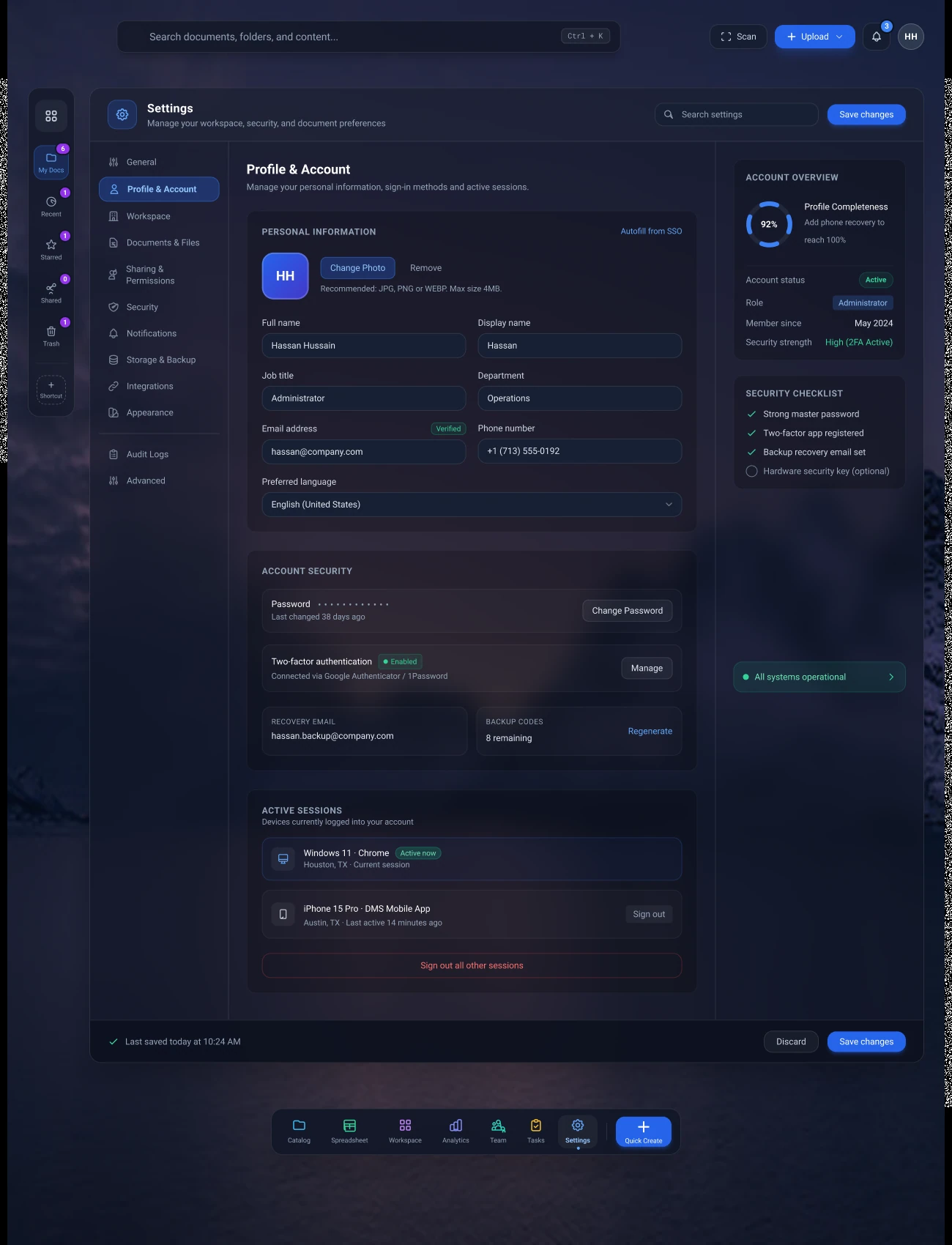
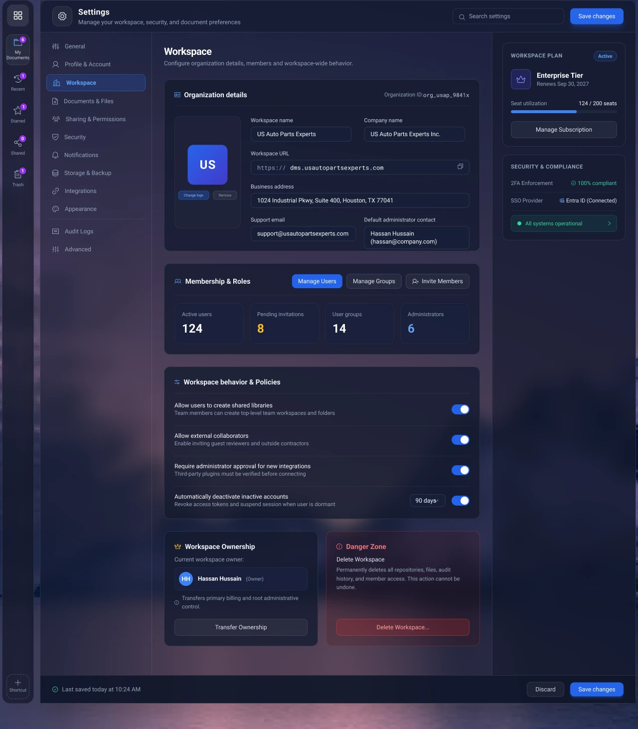
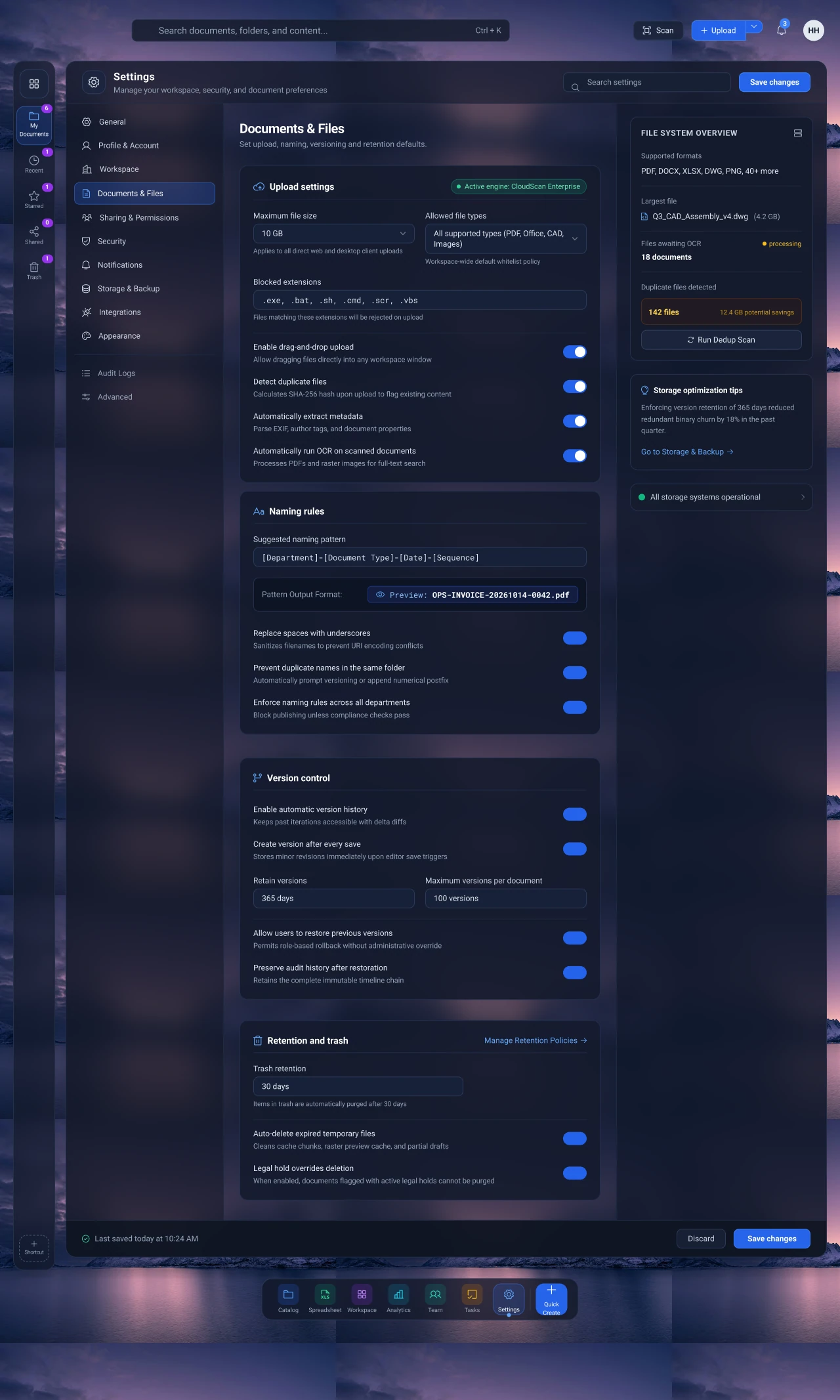
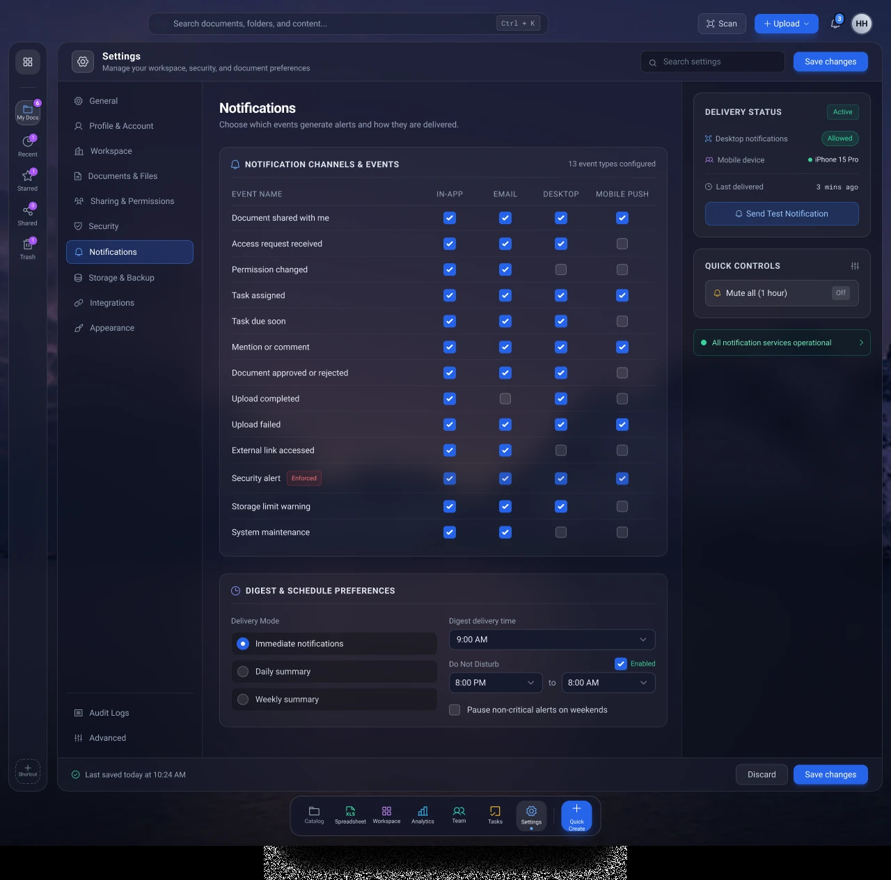
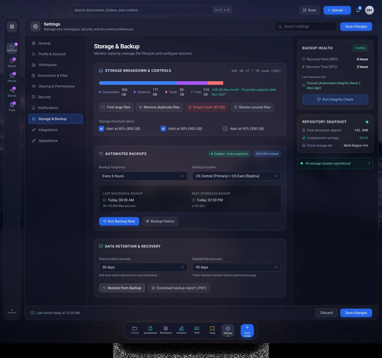
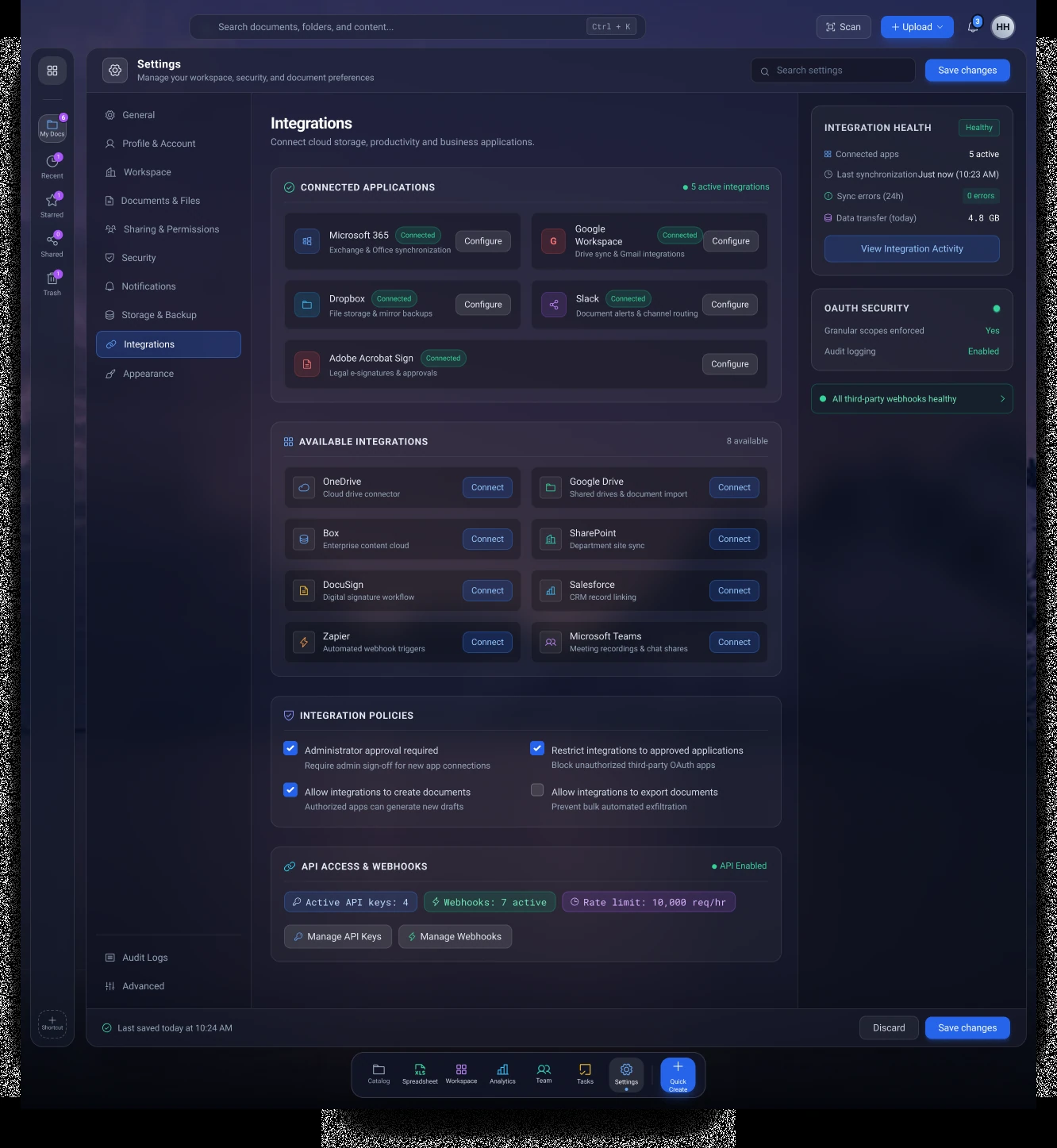
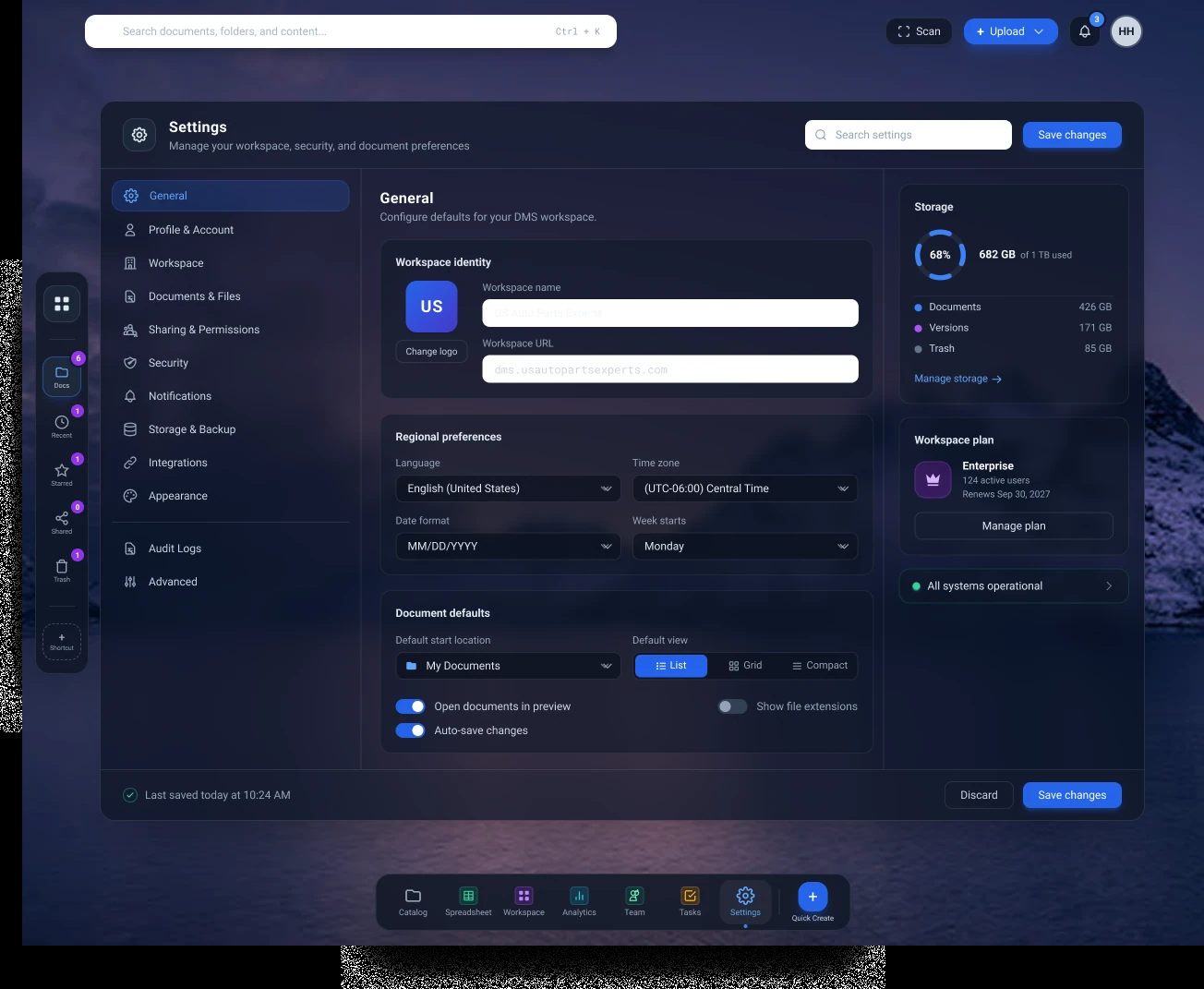
Twelve configuration categories organize the broader administrative surface.
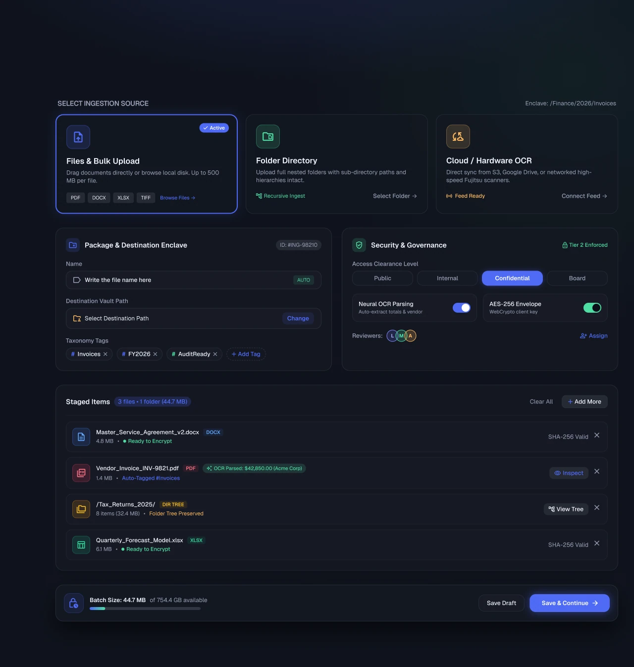
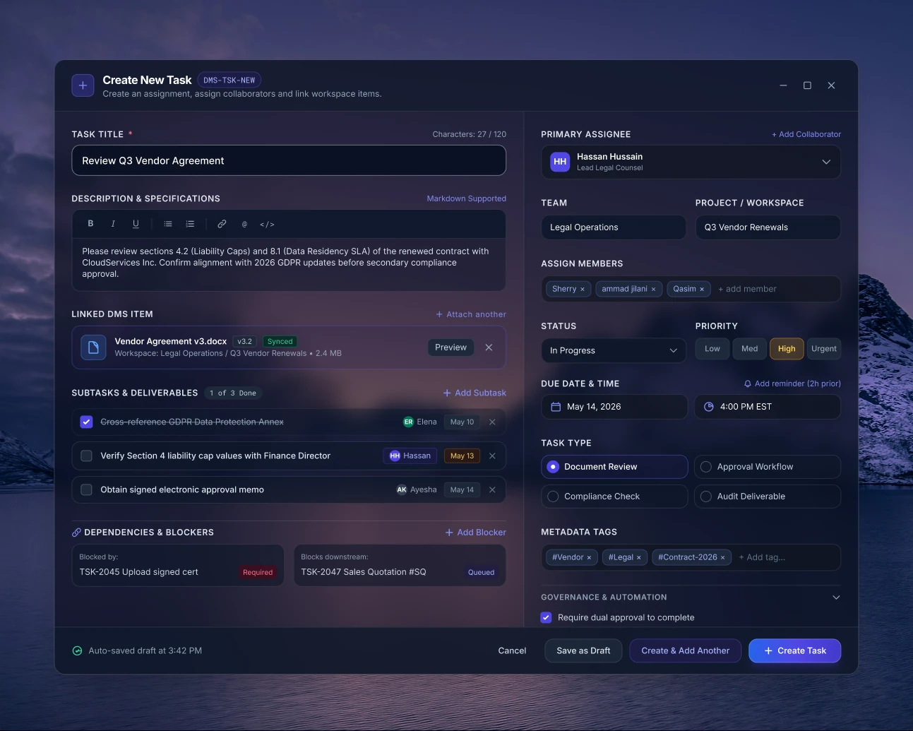
Document intake adds source choices, destination, tags, security settings, and a staged-file review. Shared-document views connect access and document context, while task creation includes supporting information and responsibility.
The intended benefit is a clearer path through the work. The screenshots demonstrate the design direction; they do not establish functioning software or measured usability gains.
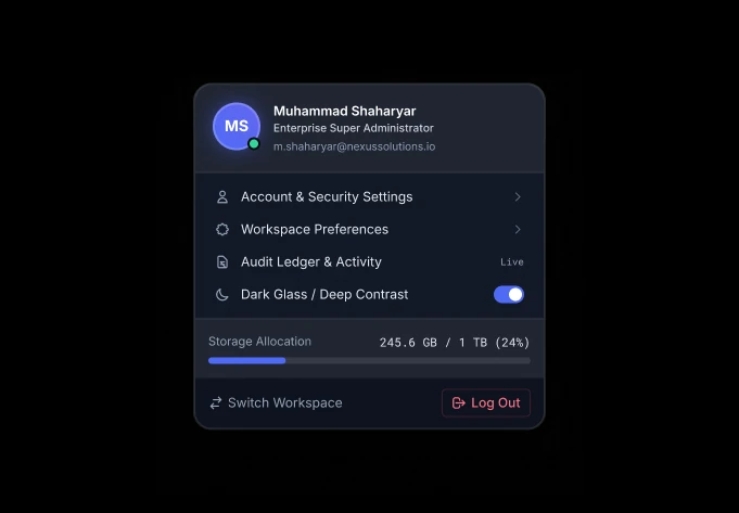
Dark navy and translucent surfaces create a shared environment. Blue and violet establish actions and selections; labeled status treatments distinguish states. Sidebars, tabs, tables, and inspectors recur across the modules.
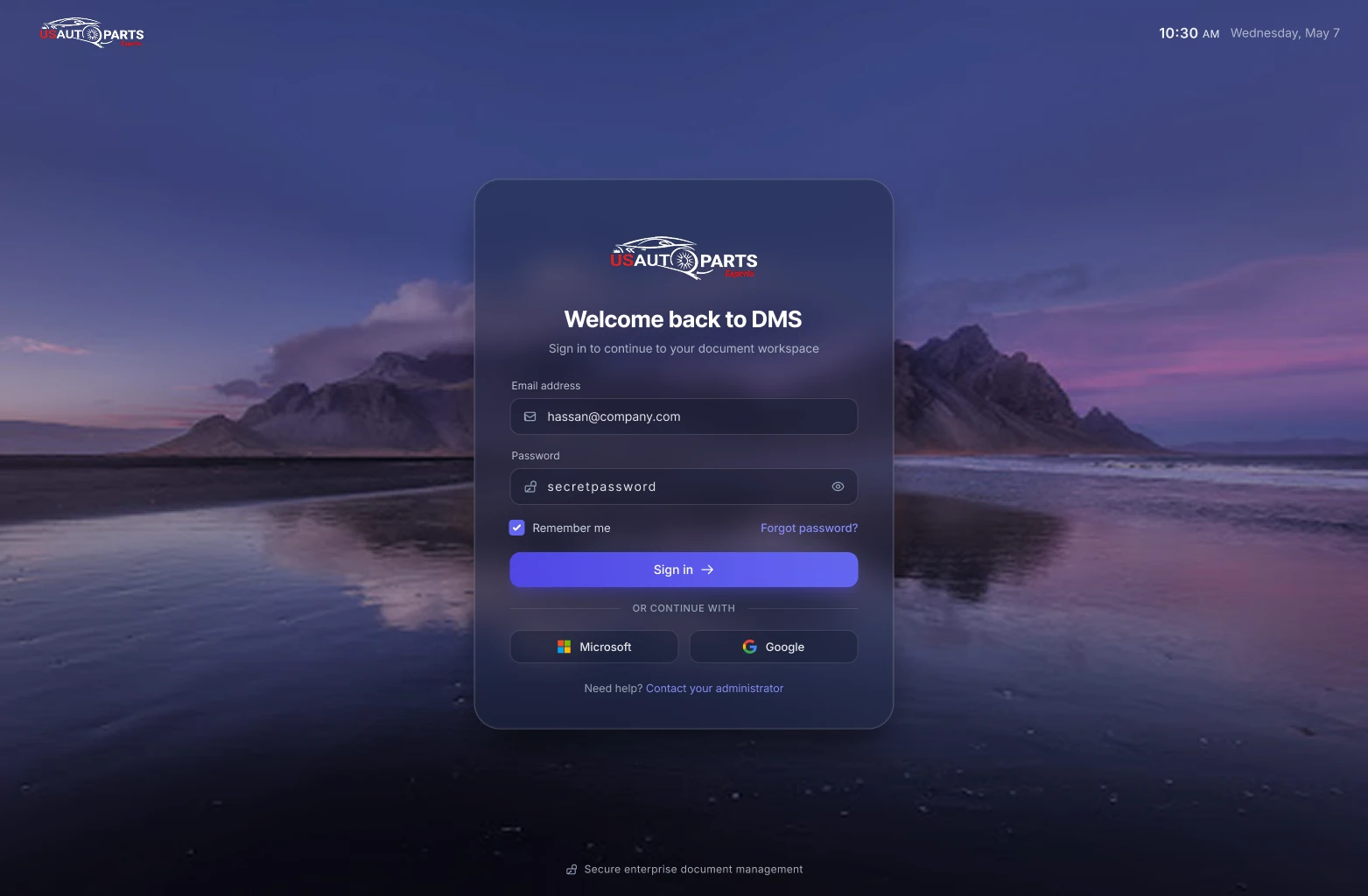
The tradeoff is density. Contrast over background imagery, long forms, wide boards, and keyboard access need careful review as the design moves into implementation.
The supplied work establishes a coherent desktop direction, more explicit document workflows, richer task coordination, and a broader settings structure. It provides a foundation for prototyping and implementation.
The next step is validation: compare task completion, errors, and confidence against the previous interface; test accessibility and smaller viewports; and align permissions and audit behavior with actual backend capabilities.
Read the full case study PDFOpen any image for a closer view. Values and names shown within the design mockups are illustrative.